Lesson 8: Data Wrangling Part 2
Readings
Required:
- Chapter 3.5-3.7 in R for Data Science (2e) by Hadley Wickham, Mine Çetinkaya-Rundel & Garrett Grolemund
Other resources:
Jenny Bryan’s lectures from STAT545 at UBC: Introduction to dplyr
Software Carpentry’s R for reproducible scientific analysis materials: Dataframe manipulation with dplyr
Learning objectives
Last class, we learned how to use dplyr functions
filter()for subsetting data with row logicselect()for subsetting data variable- or column-wise- Use piping (
|>) to implement function chains
Today, we’ll expand our data wrangling toolbox. By the end of today’s class, you should be able to:
- Subset, rearrange, and summarize data with additional key
dplyrfunctions:- Create new variables with functions of existing variables with
mutate() - Reorder the rows with
arrange() - Collapse many values down to a single summary with
summarize()andgroup_by()
- Create new variables with functions of existing variables with
- Understand the basic differences between tidyverse and base R syntax
Acknowledgements: Today’s lecture is adapted (with permission) from the excellent Ocean Health Index Data Science Training with additional input from Jenny Bryan’s lectures from STAT545 at UBC: Introduction to dplyr and Grolemund and Wickham’s R for Data Science.
Warm up - Exercise 1: Piping together select() and
filter() commands
Subset the coronavirus dataset to only include the daily counts of confirmed cases in countries located above 60 degree latitude. What are those countries?
If you have time, pipe it into ggplot() to visualize the trends over time in these countries.
Answer
click to expand
# One way to do this:

coronavirus |>
  filter(lat > 60, type == "confirmed") |>
  select(country) |>
  table()


coronavirus |>
  filter(lat > 60, type == "confirmed") |>
  ggplot() +
  geom_line(mapping = aes(x = date, y = cases, color = country))

# If you try to plot the counts by date, you may see a very rugged pattern for Canada because case counts here are reported for different provinces. To get total daily counts by country we'll have to first group_by country and date and then summarize the counts, as outlined below.
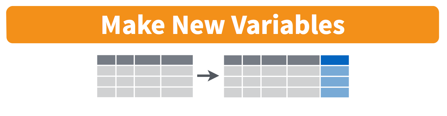
mutate() adds new variables
Alright, let’s keep going.
Besides selecting sets of existing columns, it’s often useful to add
new columns that are functions of existing columns. That’s the job of
mutate().
Visually, we are doing this (image from an earlier version of RStudio’s dplyr cheatsheet):
The current variables in the coronavirus dataset don’t lend
themselves well to cross-computation, so to illustrate the power of the
mutate() function, let’s look at the companion dataset from
the coronavirus
package on global vaccination statistics.
Details about the dataset can be found on the README file here, and the raw
.csv dataset is available here https://raw.githubusercontent.com/RamiKrispin/coronavirus/master/csv/covid19_vaccine.csv
(you can also navigate to it from the csv subdirectory and
click View raw to get the URL)
Let’s first load in the data the same way we did for the case counts dataset
vacc <- read_csv("https://raw.githubusercontent.com/RamiKrispin/coronavirus/main/csv/covid19_vaccine.csv")## Rows: 142597 Columns: 15
## ── Column specification ────────────────────────────────────────────────────────
## Delimiter: ","
## chr (6): country_region, continent_name, continent_code, combined_key, iso2...
## dbl (7): doses_admin, people_at_least_one_dose, population, uid, code3, lat...
## lgl (1): fips
## date (1): date
##
## ℹ Use `spec()` to retrieve the full column specification for this data.
## ℹ Specify the column types or set `show_col_types = FALSE` to quiet this message.# Let's have a look at this
View(vacc) # remember to only run View() interactively from the Console or an R script rather than putting it in a code chunk in a Quarto document that you plan to render.This dataset has statistics on the cumulative number of vaccine doses administered and number of people vaccinated on each day in different countries. For now, let’s just look at the most recent day included in the dataset 2023-03-09.
Imagine we want to compare the vaccination rate across countries. We
can divide the people_at_least_one_dose column with the
population column to create a new column named
vaxxrate. We do this with mutate() that is a
function that defines and inserts new variables into a tibble. You can
refer to existing variables directly by name (i.e. without the
$ operator). To make it easier to see what happens, we’ll
also select just a subset of the variables to retain from our
dataset.
vacc |>
  filter(date == max(date)) |>
  select(country_region, continent_name, people_at_least_one_dose, population) |>
  mutate(vaxxrate = people_at_least_one_dose / population)

# We can modify the mutate equation in many ways. For example, if we want to adjust the number of significant digits printed, we can type
vacc |>
  filter(date == max(date)) |>
  select(country_region, continent_name, people_at_least_one_dose, population) |>
  mutate(vaxxrate = round(people_at_least_one_dose / population, 2))
Your turn - Exercise 2
Add a new variable that shows the number of doses administered per person who has received at least one dose for each country. First look the patterns across all countries, then only show data for countries that have distributed more than 200 million doses. How many countries is that?
Answer
click to expand
# To look at patterns across all countries
vacc |>
  filter(date == max(date)) |>
  select(country_region, continent_name, doses_admin, people_at_least_one_dose, population) |>
  mutate(doses_per_vaxxed = doses_admin / people_at_least_one_dose)

# We can scroll through the output and eyeball patterns, but we can also pipe the output directly into ggplot!
vacc |>
  filter(date == max(date)) |>
  select(country_region, continent_name, doses_admin, people_at_least_one_dose, population) |>
  mutate(doses_per_vaxxed = doses_admin / people_at_least_one_dose)  |>
  ggplot() +
  geom_histogram(mapping = aes(x = doses_per_vaxxed))


# To subset the output, we can add another filter step
vacc |>
  filter(date == max(date)) |>
  select(country_region, continent_name, doses_admin, people_at_least_one_dose, population) |>
  mutate(doses_per_vaxxed = doses_admin / people_at_least_one_dose) |>
  filter(doses_admin > 200 * 10^6)


# We can also use this to identify outliers in our histogram above
vacc |>
  filter(date == max(date)) |>
  select(country_region, continent_name, doses_admin, people_at_least_one_dose, population) |>
  mutate(doses_per_vaxxed = doses_admin / people_at_least_one_dose)  |>
  filter(doses_per_vaxxed > 3)
When you’re done, sync your R script to Github (pull, stage, commit, push).
arrange() orders rows
For examining the output of our previous calculations, we may want to
re-arrange the countries in ascending or descending order for
vaccination rate. The dplyr function for sorting rows is
arrange().
vacc |>
  filter(date == max(vacc$date)) |>
  select(country_region, continent_name, doses_admin, people_at_least_one_dose, population) |>
  mutate(doses_per_vaxxed = doses_admin / people_at_least_one_dose)  |>
  arrange(doses_per_vaxxed)

# or

vacc |>
  filter(date == max(vacc$date)) |>
  select(country_region, continent_name, doses_admin, people_at_least_one_dose, population) |>
  mutate(doses_per_vaxxed = doses_admin / people_at_least_one_dose)  |>
  arrange(desc(doses_per_vaxxed))
I advise that your analyses NEVER rely on rows or variables being in a specific order. But it’s still true that human beings write the code and the interactive development process can be much nicer if you reorder the rows of your data as you go along. Also, once you are preparing tables for human eyeballs, it is imperative that you step up and take control of row order.
Your turn - Exercise 3
In how many countries do >90% of the population have at least one dose and which five countries have the highest vaccination rates (proportion of their population given at least one dose), according to this dataset?
Answer
click to expand
vacc |>
  filter(date == max(vacc$date)) |>
  select(country_region, continent_name, people_at_least_one_dose, population) |>
  mutate(vaxxrate = round(people_at_least_one_dose / population, 2)) |>
  arrange(desc(vaxxrate)) |>
  filter(vaxxrate > 0.9)
Your turn again - Exercise 4
- Go back to our original dataset
coronavirusand identify where and when the highest death count in a single day was observed. Hint: you can either usebase::maxordplyr::arrange().
- The first case was confirmed in the US on January 20 2020, two days before the earliest day included in this dataset. When was the first confirmed case recorded in Canada?
Answer
click to expand
# Identifying the record with the highest death count
coronavirus |>
  filter(type == "death") |>
  arrange(desc(cases))

# We can also just identify the top hit
coronavirus |>
  filter(type == "death") |>
  filter(cases == max(cases))

# The first recorded case in Canada
coronavirus |>
  filter(country == "Canada", cases > 0) |>
  arrange(date)
Grouped summaries with summarize() and
group_by
The last key dplyr verb is summarize(). It
reduces multiple observations to summary values. Without grouping, it
typically produces one row; when used with group_by(), it
produces one summary row for each group. Visually, we are doing this
(image from an earlier version of RStudio’s dplyr cheatsheet):

We can use it to calculate the total number of confirmed cases detected globally since 1-22-2020 (the beginning of this dataset)
coronavirus |>
  filter(type == "confirmed") |>
  summarize(sum = sum(cases))
This number could also easily have been computed with base-R
functions. In general, summarize() is not terribly useful
unless we pair it with group_by(). This changes the unit of
analysis from the complete dataset to individual groups. Then, when you
use the dplyr verbs on a grouped data frame they’ll be
automatically applied “by group”. For example, if we applied exactly the
same code to a data frame grouped by country, we get the total number of
confirmed cases for each country or region.
coronavirus |>
  filter(type == "confirmed") |>
  group_by(country) |>
  summarize(total_cases = sum(cases))
Now that’s a lot more useful!
We can also use summarize() to check how many
observations (dates) we have for each country
coronavirus |>
  filter(type == "confirmed") |>
  group_by(country) |>
  summarize(n = n())
Why do some countries have much higher counts than others?
We can also do multi-level grouping. If we wanted to know how many of each type of case there were globally on Jan 1, 2023, we could chain these functions together:
coronavirus |>
  group_by(date, type) |>
  summarize(total = sum(cases)) |>  # sums the count across countries
  filter(date == "2023-01-01")
Your turn - Exercise 5
Which day has had the highest total death count globally reported in this dataset?
Pipe your global daily death counts into ggplot to visualize the trend over time.
Answer
click to expand
coronavirus |>
  filter(type == "death") |>
  group_by(date) |>
  summarize(total_deaths = sum(cases)) |>
  arrange(desc(total_deaths))

# Or

coronavirus |>
  filter(type == "death") |>
  group_by(date) |>
  summarize(total_deaths = sum(cases)) |>
  filter(total_deaths == max(total_deaths))

# With plotting

coronavirus |>
  filter(type == "death") |>
  group_by(date) |>
  summarize(total_deaths = sum(cases)) |>
  arrange(desc(total_deaths)) |>
  ggplot() +
    geom_line(aes(x = date, y = total_deaths))

## We see that the last day of the dataset has a much higher reported count than all other dates, so let's remove that

coronavirus |>
  filter(type == "death", date != "2023-01-04") |>
  group_by(date) |>
  summarize(total_deaths = sum(cases)) |>
  arrange(desc(total_deaths)) |>
  ggplot() +
  geom_line(aes(x = date, y = total_deaths))
If you have more time, here is an optional question
The month() function from the package
lubridate extracts the month from a date and
year() extracts the year. How many countries already had
more than 10,000 deaths in February of 2021?
Answer
click to expand
library(lubridate) #install.packages('lubridate')

coronavirus |>
  mutate(month = month(date), year = year(date)) |>
  filter(type == "death", month == 2, year == 2021) |>
  group_by(country) |>
  summarize(total_death = sum(cases)) |>
  filter(total_death > 10000)
Extra in-class questions
Which country had the highest number of deaths on October 4 2020?
click to expand
coronavirus |>
  select(-lat, -long) |>
  filter(date == "2020-10-04", type == "death") |>
  arrange(desc(cases))
Which country had the highest count of confirmed cases in January of
2021? [Hint: to address this question the functions month()
and year() from the package lubridate might be helpful].
What about in March?
click to expand
library(lubridate) #install.packages('lubridate')

coronavirus |>
  mutate(month = month(date), year = year(date)) |>
  filter(type == "confirmed", month == 1, year == 2021) |>
  group_by(country) |>
  summarize(total_death = sum(cases)) |>
  arrange(desc(total_death))
If you’re used to working in base R, answer the same question
with base R tools. Which coding approach do you like better or what are
pros and cons of the two types of syntax?
Which countries have data for multiple states or provinces?
click to expand
coronavirus |>
  group_by(country, date) |>
  summarize(n = n()) |>
  group_by(country) |>
  summarize(maxcount = max(n)) |>
  filter(maxcount > 3)